Simple & Dynamic Business Website
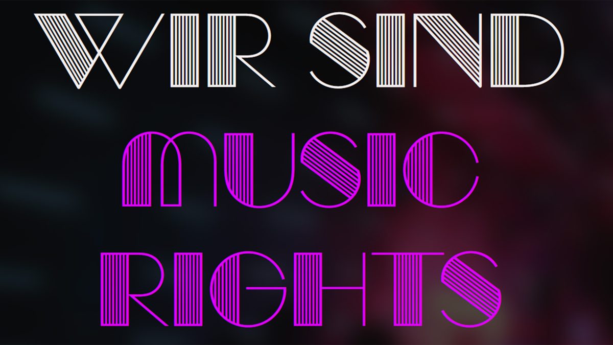
«We Are Music Rights» is a simple & dynamic business website for a music licensing company that aims to connect content creators, musicians, live event organizers, venues, and festivals with appropriate music licenses. The website serves to inform potential clients about the services offered, learn about the company, and get in touch. It was developed for the client between late January and the end of February 2025. The primary goal was to inject dynamism and appeal to a younger demographic, moving away from the previous static and dull online presence.
Key Features:
Intuitive Multilingual Support (English & German)
Clear Call to Action
Engaging Interactive Elements
Segmented User Journeys
Informative Sections
Contact Information and Form
Fully Responsive Design – 5 breakpoints
External Integrations
(vha)
Ideas and Core Concept
The core idea was to shift the website’s perception from «dull» to «engaging» to better suit a younger target audience. This mandated a departure from conventional corporate web design towards a more modern, interactive, and visually striking aesthetic. The underlying business function of music licensing remained constant, but the presentation required a significant refresh.
The website effectively communicates its purpose through its clear segmentation into «I Use Music» and «I Make Music.» This direct approach helps users quickly identify the relevant information for their needs.
The inclusion of sections like «About» and «Team» is to build trust and credibility, which is crucial for a service-oriented business dealing with intellectual property. The FAQ-style accordion on the creators.html and musicians.html pages is for presenting detailed information without overwhelming the user.
Design Choices
The visual design is modern and striking, utilizing a dark background with bright, contrasting neon-like accent colors. This creates a memorable and perhaps «edgy» aesthetic. The use of a custom font (Manbow) for display text adds a unique brand identity, while Raleway ensures readability for body text.
The header, with the logo and language selector, is sticky, providing consistent navigation. The language selector’s default to German and its persistence via localStorage are for user convenience.
The interactive «Choice Section» cards, which reveal text on hover, are visually engaging and provide a good balance between aesthetics and information delivery. Similarly, the animated appearance of elements on scroll (using animation-timeline: view()) adds a dynamic feel without being overly distracting. The rotating vinyl image in the hero section is a thematic visual element.
Challenges
Several challenges were encountered during the development of this website:
- Multilingual Implementation: Managing and displaying content in two languages (.en and .de classes) and ensuring smooth switching without full page reloads requires careful JavaScript implementation and consideration of content synchronization. The current method relies on JavaScript to toggle display properties, which works but might not be ideal for larger, more complex multilingual sites (where server-side rendering or dedicated translation frameworks might be considered).
- Responsive Design Complexity: Building a responsive layout that adapts gracefully across five distinct breakpoints (mobile, tablet, medium, large, extra-large) for various sections, including grid layouts (hero, choice, features, team), demands significant CSS media query work and testing.
- Animation Performance: While subtle, animations can sometimes impact performance, especially on lower-powered devices. Careful optimization of CSS animations (cubic-bezier timing functions) and avoiding excessive use of transform properties that trigger layout shifts were important considerations. The animation-timeline: view() and animation-range properties are modern CSS features that provide efficient scroll-based animations.
- JavaScript for Dynamic Content: The JavaScript handles language switching and the dynamic shuffling of team member images. Ensuring this JavaScript runs efficiently and doesn’t block the main thread, especially on page load, was important. The image randomization logic (avoiding repeats) adds a layer of complexity.
- Form Submission: Relying on a third-party service like Formsubmit.co simplifies backend form processing but requires trust in that service and adherence to its usage policies. Implementing a custom backend solution for form submission would add complexity but offer more control.
Learnings
- Client Vision as a Guiding Principle: The clear directive to create a «dynamic» and «younger» website was instrumental in shaping all design and development decisions. Translating abstract client desires into concrete technical and visual implementations.
- Efficiency in Multilingual Setup: The chosen JavaScript-based language toggling method, while having scalability limits, proved highly efficient for quick deployment within the project’s scope. It provided a fast way to deliver the bilingual requirement without complex server-side solutions.
- Impact of Subtle Dynamics: It became clear that even subtle animations and interactive elements can significantly alter a website’s perceived dynamism and user engagement, without requiring overly complex or resource-intensive implementations.
- Iterative Refinement for Responsiveness: Achieving pixel-perfect responsiveness across many breakpoints is rarely a first-pass success. The process reinforced the need for continuous testing and iterative adjustments of CSS media queries.
- Leveraging Modern CSS Features: The project provided an opportunity to effectively apply advanced CSS features like variables, Grid, and animation-timeline, demonstrating their power in creating sophisticated and maintainable designs.